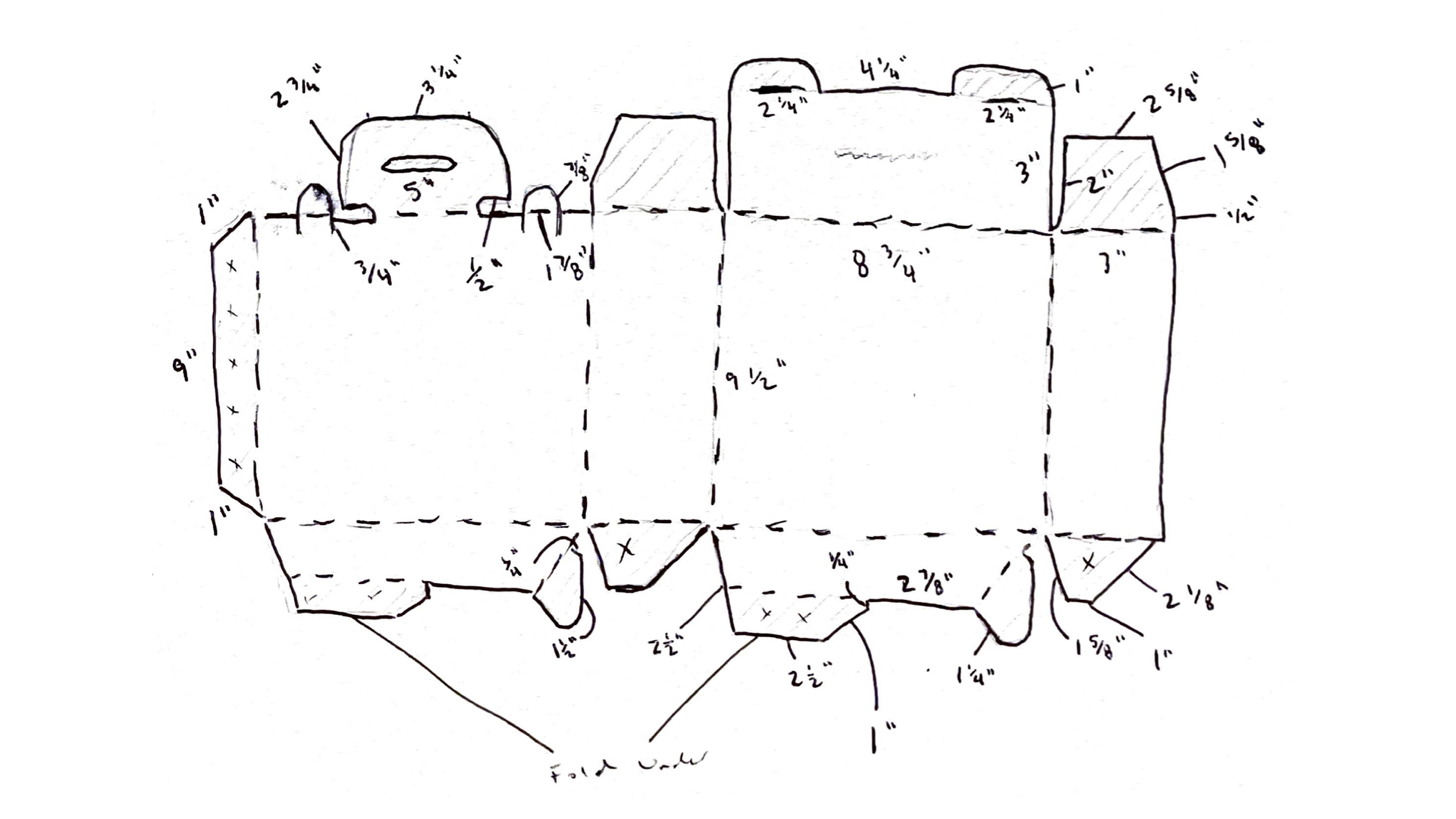
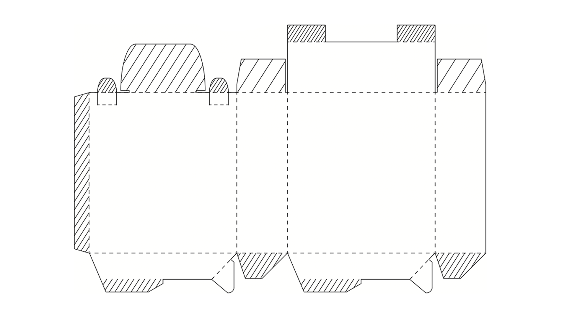
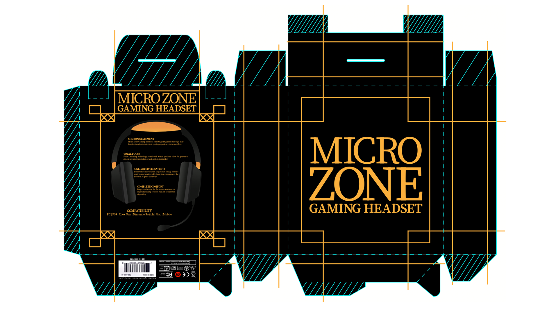
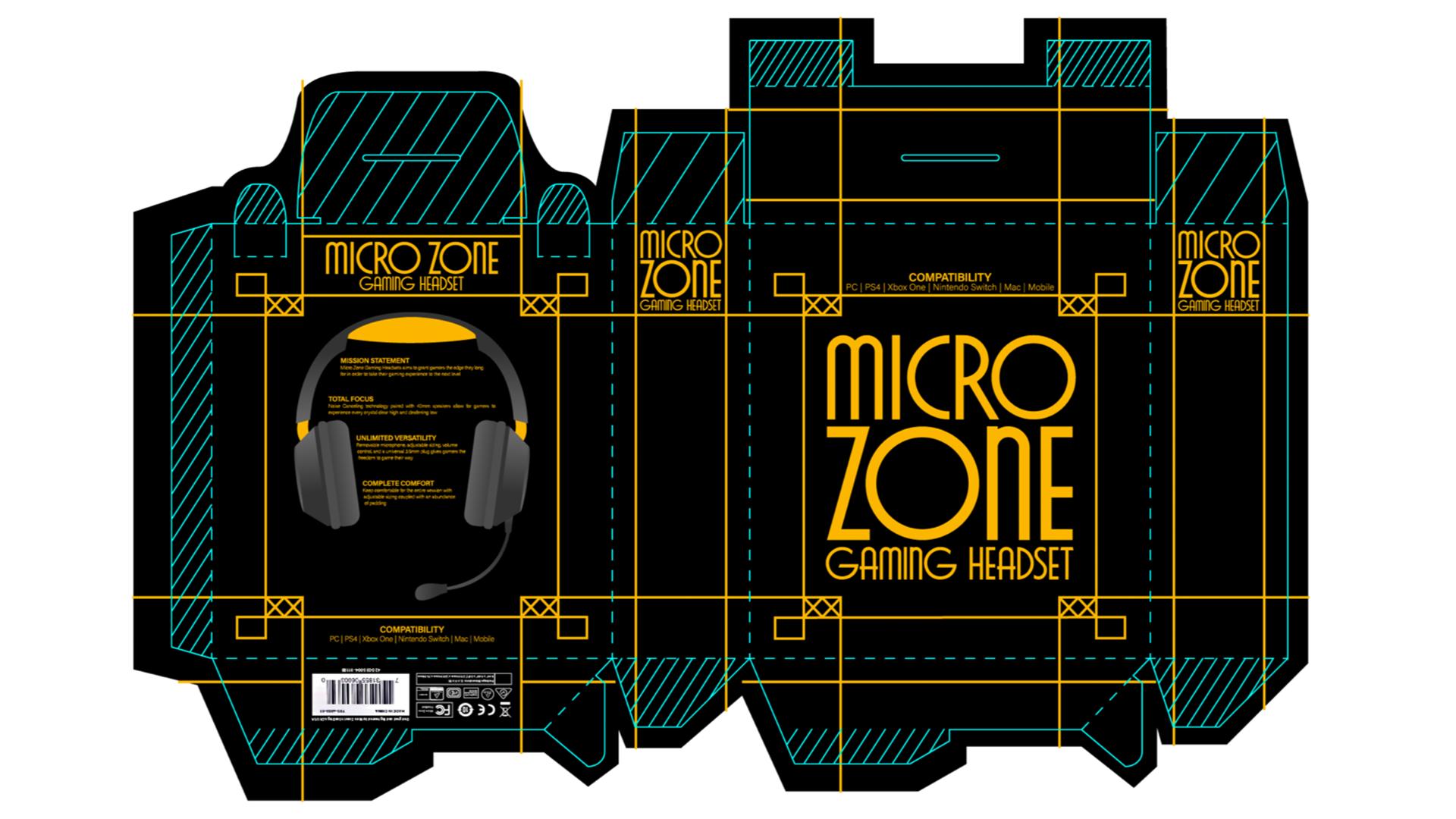
This project was a fun one that involved re-designing a gaming headset package. Something I found to be really valuable that I took away from this project was working with bleeds, die-lines and other printing techniques. I had no previous experience working in print so this was a great way for me to learn the ropes.


The original design of the box was white and silver with red accents, and I felt that a change might make this apparel a bit more appealing. The black and gold color scheme along with the typeface choice were done in an effort to emulate the style and mood of the roaring twenties, an era often seen as one of glitz, glam, and luxury. Gold is also commonly associated with winning and success, something that all gamers strive for. The brand name Micro Zone is a nod to the extreme focus players must equip in order to be the best at what they do.